
In this paper titled “Simple as it can be, but not simpler: Perceived elegance as effective complexity in Interface Design” and that has received a best paper award at the 2020 AMCIS conference, we propose and test a method to measure the elegance of an interface (the paper and the presentation are both accessible at this link).

Our empirical results show that the metric is strongly correlated with perceived elegance and actual effort in the use of a new product. There are two key ideas behind the metric:
- elegance has an objective component that is associated with how information is distributed over an interface
- an elegant interface maximizes meaning for the user using as little information as possible
From these two requirements, it follows that there must be some optimal distribution of this information that is associated to a higher level of perceived elegance (of course, the notion of objective elegance does not rule out other subjective or socially situated factors that we do not measure in our research). In our study, we have asked users to rate different control panels of microwave ovens, so in this case study, the information is distributed on the interface by creating controls such as buttons, knobs, displays, etc. Of course, there are countless ways of creating these controls and arranging them on the panel.
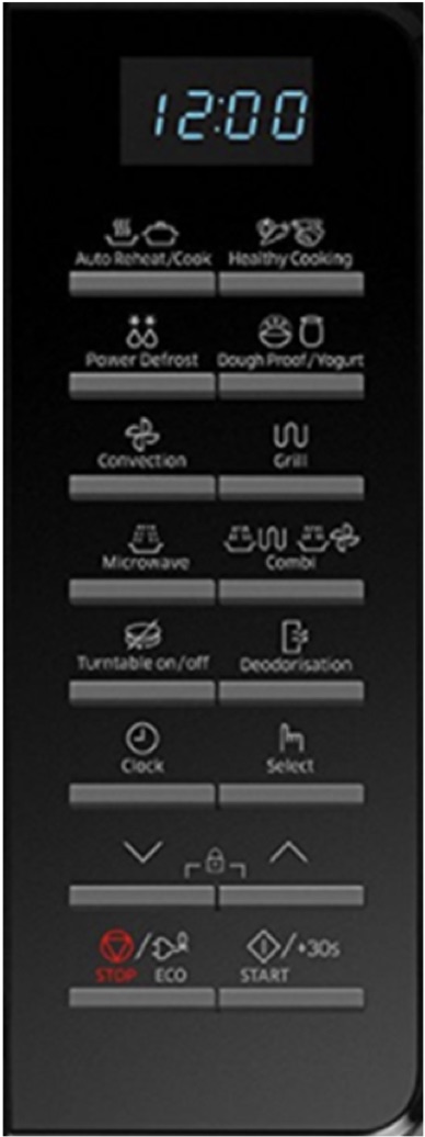

Figure 1: On the left side of the following figure you can see an example of a model and of how information is distributed. On the right side some models are ranked in terms of their effective complexity, models closer to the peak of the curve are perceived as more elegant
Here is how our metric can help designers to predict which arrangements are more likely to trigger the perception of elegance. It turns out that the most elegant panels are the ones that have the highest effective complexity, i.e. an intermediate level of complexity that is achieved when the interface appears to be neat and simple but not boring. We measure this intermediate level in terms of entropy using ideas from information theories and our findings show that users preferred the interfaces that exhibited some entropy. Entropy is a measure of disorder, so it seems odd that users may appreciate disordered interfaces. In fact, they do, and the reason is that users tend to enjoy some complexity, as Don Norman put it in his book Living with Complexity.
Why do we like some complexity? And what kind of complexity do we like?
We appreciate some complexity because complexity is also associated with arousal, excitement, surprise, novelty, and additional performance. As to what complexity do we like, it is the complexity that promises to be resolved with little effort. This is why we think elegance is an important property of an interface. An elegant interface is not only aesthetically pleasing but is also easier to discover and figure it out. Not only it guides us in discovering how we can effectively use a product, but it gives us a pleasure jolt that this discovery turned out to be less difficult than it appeared. In other words, an elegant interface facilitates problem-solving and, perhaps, help us to feel smarter problem solvers.
This is why ‘elegant’ is more important than just ‘beautiful’. An elegant interface is easier to figure out and operate, so it requires less effort from the users, but it allows users to accomplish more. A result that our study confirmed.
